Consistency at the core, flexibility at the edges.
Adapting Design at Scale
TL;DR — In a company with many audiences, brands, and safety-critical contexts, one size doesn’t fit all. I designed a constraint-aware token and theming system that lets teams adapt density, emphasis, and color safely (e.g., no red primaries for train drivers), while keeping a single, accessible foundation used across B2C and B2B products. Result: consistency where it matters, tailored interfaces where it’s needed.
Context & challenge
DB’s product landscape spans B2C apps for millions of passengers and B2B/operational tools for dispatching, infrastructure, and logistics. Designers are embedded in IT-led teams across business units with additional brand requirements. Previous guidelines were either too rigid (blocking necessary adaptations) or too loose (causing fragmentation). We needed a model that keeps coherence at the core and enables safe variation at the edges—for audiences and brands.
My role
Design System Lead. I defined the principles, token & theme architecture, and the governance + tooling to ship it. I partnered with product designers, engineering, brand, and accessibility.
Specs
Headline Size
Text Size
Spacing
Tokens
code-mapping-headline-h6-black
code-mapping-body-md-regular
db-spacing-fixed-md
Specs
Background Color
Text Color
Border Color
Tokens
db-adaptive-bg-basic-level-1-default
db-adaptive-on-bg-basic-emphasis-100-default
db-adaptive-on-bg-basic-emphasis-60-default
The tokens
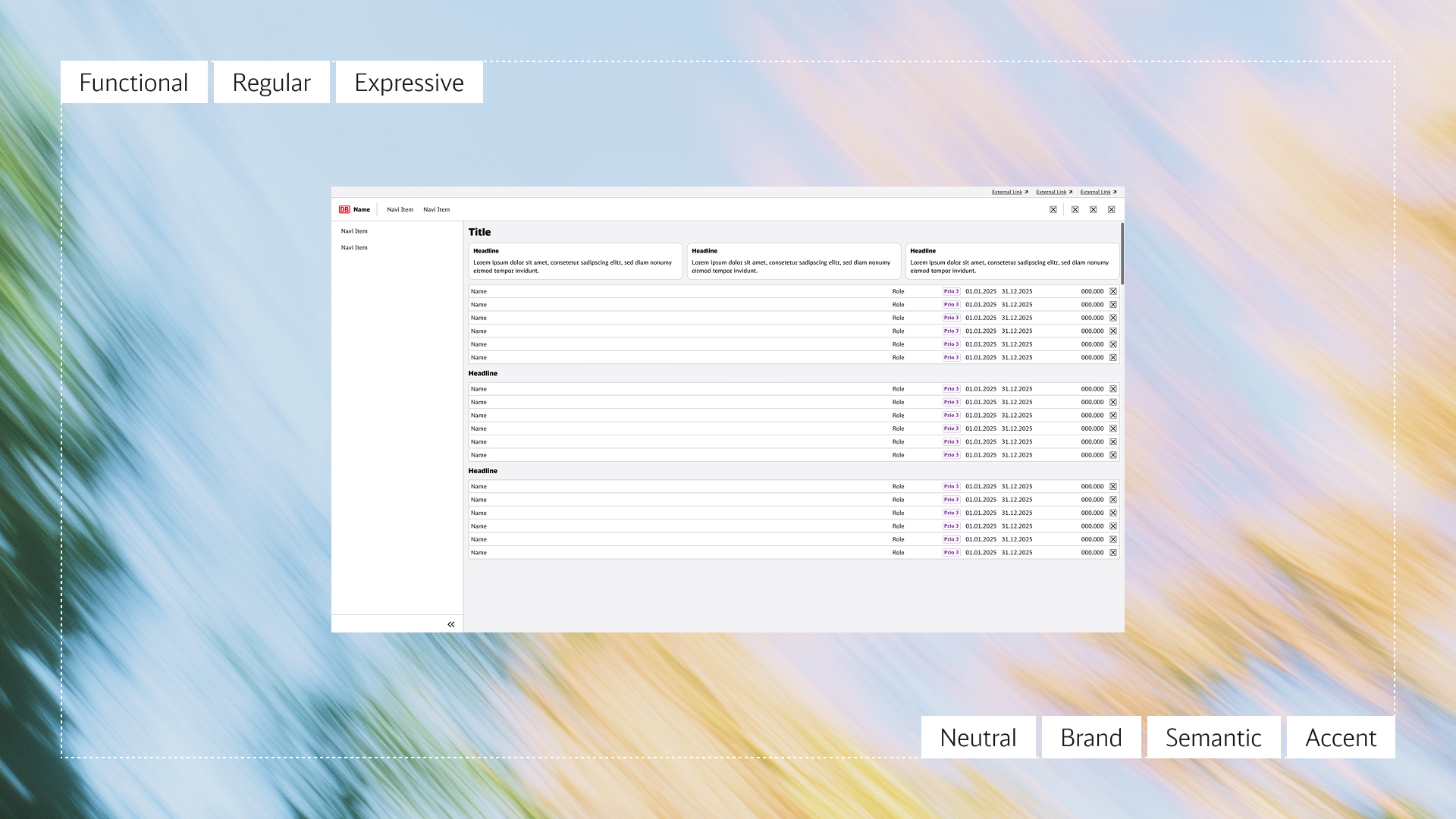
Densities
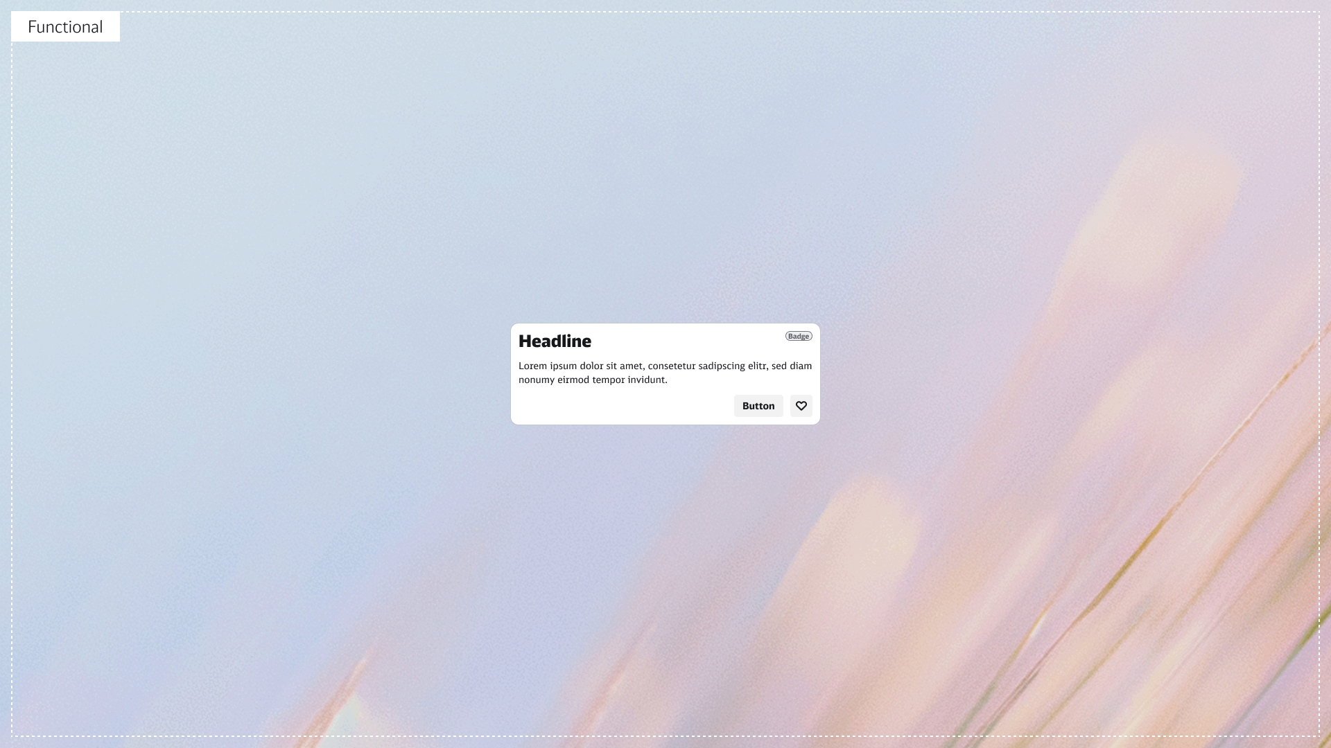
Same component API, three presentation modes:
- Functional — compact, low emphasis for data-dense tools.
- Regular — default application mode.
- Expressive — high emphasis for public/brand-forward contexts.
Typography steps, spacing, and emphasis scale via tokens;
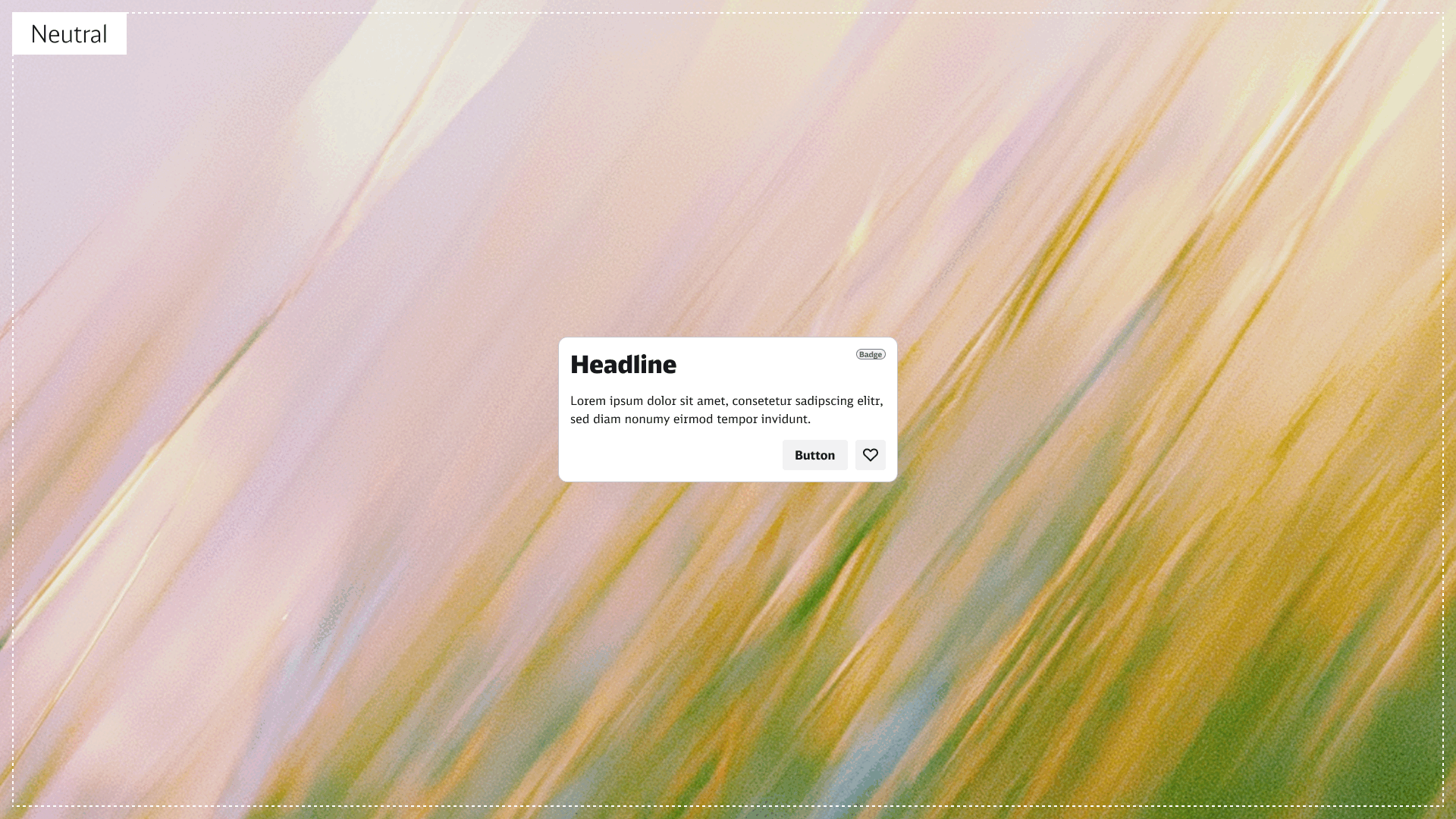
Colors
Color Tokens map:
- brand
- neutral
- semantic
- accent
Backgrounds, borders, and text change with guardrails prevent unsafe choices to meet WCAG.
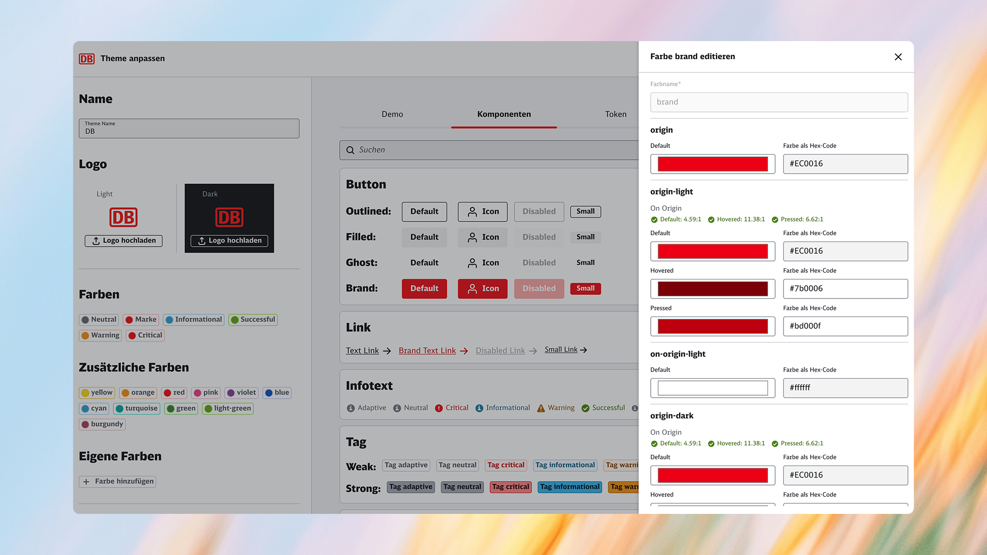
Theme Builder — create and extend themes safely
We built a Theme Builder so teams can create new themes or add color families following the same logic—without breaking accessibility or semantics.
How it works
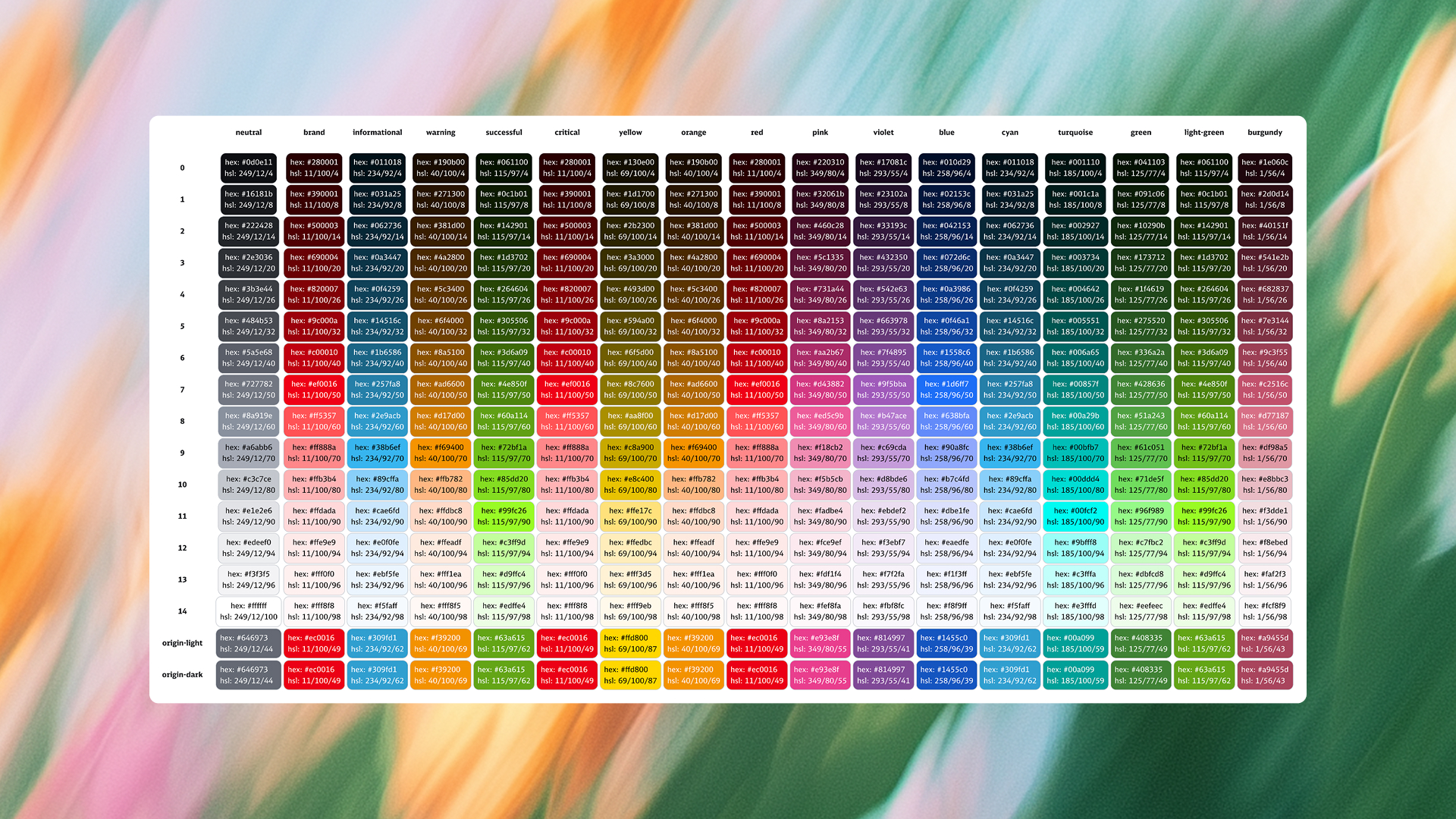
- Start with a multi-step palette. Each family (e.g., neutral, brand, informational, warning, success, critical) is generated as a 15-step scale (tints/shades + origin-light/origin-dark).
- The builder automatically assigns palette steps to tokens while ensuring WCAG contrast for text/background pairs (e.g., bg-basic-level-1-default/hovered/pressed, on-bg-basic-emphasis-100-default/hovered/pressed, bg-inverted-contrast-max-default).
- Ship to design & code. Figma variables mirror the tokens; a pipeline exports JSON → platform tokens. Previews show components and states before publishing.
Summary
A single, constraint-aware design system lets teams adapt density, emphasis, and color to audience and context—without forking. Core tokens and one component API keep behavior consistent; safe color semantics and the Theme Builder give controlled flexibility.
Result: consistency where it matters, tailored interfaces where it’s needed, with accessibility enforced by default.
Impact:
- Brand onboarding becomes fast and safe.
- Domain themes follow the same semantics.
- Accessibility is enforced by the system, not left to chance.
Consistency at the core, flexibility at the edges.
Adapting Design at Scale
TL;DR — In a company with many audiences, brands, and safety-critical contexts, one size doesn’t fit all. I designed a constraint-aware token and theming system that lets teams adapt density, emphasis, and color safely (e.g., no red primaries for train drivers), while keeping a single, accessible foundation used across B2C and B2B products. Result: consistency where it matters, tailored interfaces where it’s needed.
Context & challenge
DB’s product landscape spans B2C apps for millions of passengers and B2B/operational tools for dispatching, infrastructure, and logistics. Designers are embedded in IT-led teams across business units with additional brand requirements. Previous guidelines were either too rigid (blocking necessary adaptations) or too loose (causing fragmentation). We needed a model that keeps coherence at the core and enables safe variation at the edges—for audiences and brands.
My role
Design System Lead. I defined the principles, token & theme architecture, and the governance + tooling to ship it. I partnered with product designers, engineering, brand, and accessibility.
Specs
Headline Size
Text Size
Spacing
Tokens
code-mapping-headline-h6-black
code-mapping-body-md-regular
db-spacing-fixed-md
Specs
Background Color
Text Color
Border Color
Tokens
db-adaptive-bg-basic-level-1-default
db-adaptive-on-bg-basic-emphasis-100-default
db-adaptive-on-bg-basic-emphasis-60-default
The tokens
Densities
Same component API, three presentation modes:
- Functional — compact, low emphasis for data-dense tools.
- Regular — default application mode.
- Expressive — high emphasis for public/brand-forward contexts.
Typography steps, spacing, and emphasis scale via tokens;
Colors
Color Tokens map:
- brand
- neutral
- semantic
- accent
Backgrounds, borders, and text change with guardrails prevent unsafe choices to meet WCAG.
Theme Builder — create and extend themes safely
We built a Theme Builder so teams can create new themes or add color families following the same logic—without breaking accessibility or semantics.
How it works
- Start with a multi-step palette. Each family (e.g., neutral, brand, informational, warning, success, critical) is generated as a 15-step scale (tints/shades + origin-light/origin-dark).
- The builder automatically assigns palette steps to tokens while ensuring WCAG contrast for text/background pairs (e.g., bg-basic-level-1-default/hovered/pressed, on-bg-basic-emphasis-100-default/hovered/pressed, bg-inverted-contrast-max-default).
- Ship to design & code. Figma variables mirror the tokens; a pipeline exports JSON → platform tokens. Previews show components and states before publishing.
Summary
A single, constraint-aware design system lets teams adapt density, emphasis, and color to audience and context—without forking. Core tokens and one component API keep behavior consistent; safe color semantics and the Theme Builder give controlled flexibility.
Result: consistency where it matters, tailored interfaces where it’s needed, with accessibility enforced by default.
Impact:
- Brand onboarding becomes fast and safe.
- Domain themes follow the same semantics.
- Accessibility is enforced by the system, not left to chance.